
Digital Agency Blog
Pick a Color, Any Color—and Stick to It
Tiffany Blue. Barbie Pink. John Deere Green.
These colors might evoke certain emotions or desires in consumers. Tiffany Blue is a coveted color, regardless of what item is inside of those distinctive teal shopping bags. Barbie Pink likely evokes a sense of nostalgia or brings to mind the bright pink of the toy aisle where the dolls reside. John Deere is near synonymous with the green hue of its products, which bring to mind the outdoors and nature, as well as a sense of rugged outdoorsmanship.
Ultimately, these colors are linked to the products in the consumer’s mind, even if they may not consciously make the connection. For example, McDonald’s famous golden arches has a trademarked pantone. The name of the specific shade of yellow used? French fry gold. Doesn’t it make you hungry just thinking about it? This example begs the question: How can your brand use color choice to make a stronger connection with your consumer base? It starts with being astute in the use of color for any branding you want to make an impact on your market.
How Important is Color, Anyway?
Colors have distinctive and, much like Neuromarketology reveals, differing connections with people based on their demographics, desires, socio-economic backgrounds, and other factors.
Brand recognition is influenced by color up to 80 percent of the time, according to research from the University of Loyola, Maryland, and consumers make a judgment about a product quickly and “between 62% and 90% of that assessment is based on color alone.”
The perception of certain colors or color combinations differ by culture and context, which is something to be considered for any international campaigns. For example, the red, white, and prominent blue of Pepsi’s logo and its cans might evoke a sense of patriotism in the United States. But the distinctive red of Coca-Cola has an arguably larger nostalgic hold domestically and abroad.
Pepsi previously tried to establish a bigger hold on the Asian market by reportedly replacing its vending machines with an icy shade of blue rather than its classic, royal blue hue, resulting in decreased sales in the 1950s in Southeast Asian countries where light blue is associated with death and mourning. What was meant to be a “refreshing” color change ended up as a costly marketing lesson for the soda maker.
How Do I Pick the Right Color or Color Palette for My Brand and/or Logo?
When considering color choices for your brand, you may first want to consider how to stand out from competitors in your market. Choosing colors evocative of your offerings is one way to create a connection between your branding and your product—consider how UPS claimed the color brown, the color of most packages the company transports as well as its famous brown trucks, and even made it a part of its core mission to consumers with its former slogan, “What can brown do for you?”
There are also emotional and psychological connotations with color to consider, such as blue often being a color associated with authority, stability, and trust. This may be why it is often chosen in the U.S. for branding by banks and other financial institutions like Citi, Chase, and others. Green, the color of wealth and abundance, is another popular choice!
Of course, there are multiple meanings or associations for colors for most people. As with anything else in marketing, context and positioning are key. This becomes more complicated when choosing multiple color combinations or even accent colors just to switch things up from time to time.
There is much more to be said about intentionally choosing the colors of your brand design. Leading design software maker Adobe has a blog about choosing a complementary color palette with core color theory and design principles in mind.
Why is it Necessary to Have a Limited Color Palette for My Logo and Other Branding?
Companies, websites, and publications have style guides to keep a consistent look and to help their audience know what to expect as well as make the call to action standout. After all, how are your customers going to complete the sale if that “Add to Cart” button doesn’t pop?
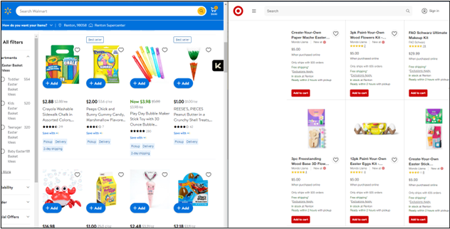
Figure 1 Whether Target Red or Walmart Blue, successful brands use color purposefully.
If you want your branding choices to take hold, people need repeated exposure to it and the core color palette you’ve established for your company. By maintaining a consistent look and palette, you give your target audiences the chance to build familiarity with your brand.
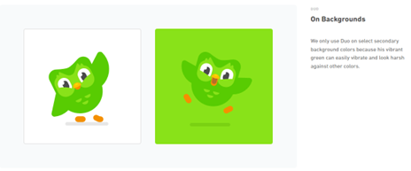
Figure 2: Duolingo's owl mascot, Duo, is a distinct green that requires specific branding considerations
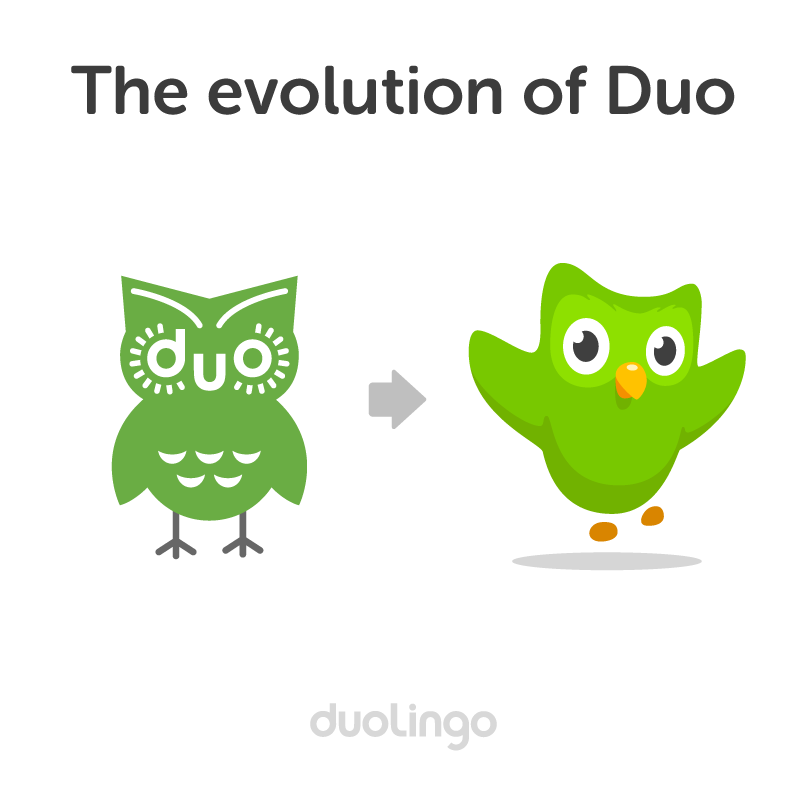
Duolingo, a popular foreign language learning app, sticks to its core bright green for its memorable owl character, Duo, even as the design became more anthropomorphized over the years.
The result is an iconic app icon and mascot design that encourages users to login day after day to engage in language learning activities.
The color selection of green for Duo has a humorous origin. According to Duolingo Designer Jack Morgan, it started with Duolingo CTO Severin Hacker stating, “I don’t much care what you do in terms of style, but please don’t use green. I hate green.”
Duolingo’s Cofounder and CEO Luis von Ahn in 2011 asked that the logo be an owl to represent knowledge, and also requested it to be green, “purely to annoy Severin,” according to Morgan.
The vibrant owl Duo has connected with foreign language learners and the larger community through its daily reminders to login to the language learning app. With over 3 million paid subscribers and nearly 50 million monthly active users (as of 2022), it is hard to argue with the results of Duolingo connecting people with its educational app in part due to its memorable bright green reminders!
Don't Stray from Your Established Color Palette—Consider Adjusting Imagery Instead
We've established how important the continuity of brand color is to hold real estate at the front of the consumer's mind. With this principle, it becomes advisable to change the imagery around your established branding rather than changing the color palette of your design.
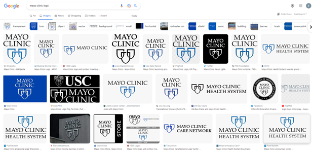
While it might be tempting to temporarily change your color scheme, there is something to be said for having a core palette that you commit to, much like established brands and systems. The Mayo Clinic Health System is a recognizable name and logo across the country, and yet the color scheme of blue paired with black and/or white is a simple and consistent standard that unites the many branches and divisions of the healthcare system in such a way that it inspires trust in the community.
Consider the Strengths of Committing to a Core Color Palette
When modifying brand imagery or something as crucial to your brand identity as a logo, you will want to be decisive in your approach to avoid losing what makes your brand distinctive to your customer. Because color is such a core part of how people remember a logo, it is likely the last element you would want to switch up.
If you do opt to bring in new elements to your design, it is important to keep other branding choices consistent with your established style guidelines (such as font, sizing, and so on) so that changes do not fog your branding’s impact on the customer. Remember that your customers (and potential customers) don’t see your logo or color palette nearly as often as you or your team does, so you need the opportunity to establish that connection in their mind. Variations from your chosen base color palette might muddy the connection between your company and the original color palette, so it is crucial to choose a palette you can commit to using for the long-haul.
Need help choosing a core color palette, defining your brand identity, or even building an entire marketing strategy from scratch? FabCom is the award-winning, Phoenix-based advertising agency that can get it done. Give us a call or email us and let our team of expert strategists and creatives come up with solutions to help you reach your goals and bring your advertising vision to reality.