Digital Agency Blog
Designing for Accessibility Without Compromising Aesthetics
Accessibility has a reputation problem. Somewhere along the way, it picked up an unfair label as the fun-sponge of design. The myth goes something like this: if a website is accessible, it must also be boring, boxy, and allergic to personality. Clean? Yes. Compliant? Sure. Beautiful? Allegedly not.
At FabCom, we’d like to politely but firmly retire that myth. Designing for accessibility doesn’t mean sacrificing aesthetics. In fact, when done right, accessibility enhances visual polish, strengthens brand storytelling, and improves performance across the board. Think of it less as a constraint and more as a creative brief that leads to better outcomes.
The Myth: Accessibility Kills Creativity
Accessibility has long been framed as the creativity limiter in digital design, as if meeting guidelines automatically strips a project of personality, visual energy, and brand voice. This misconception often stems from treating accessibility as an afterthought rather than a core design strategy.
Accessibility does not mean:
- Everything must be black and white
- Bold typography, animation, or color are off-limits
- Layouts must feel generic, rigid, or templated
What accessibility demands is intentional website design. When UX/UI designers understand accessibility standards early in the process, they make more deliberate creative choices about contrast, hierarchy, spacing, motion, and content structure. Those decisions tend to produce cleaner layouts, stronger storytelling, and more confident visual systems.
Constraints don’t stifle creativity. They focus it. And when accessibility is treated as a creative brief instead of a compliance checklist, the result is design that feels more polished, more usable, and more human.
Great UX design isn’t about removing creativity. It’s about directing it with purpose.
– Trevor McBride, Interactive Creative Director at FabCom
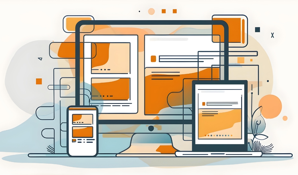
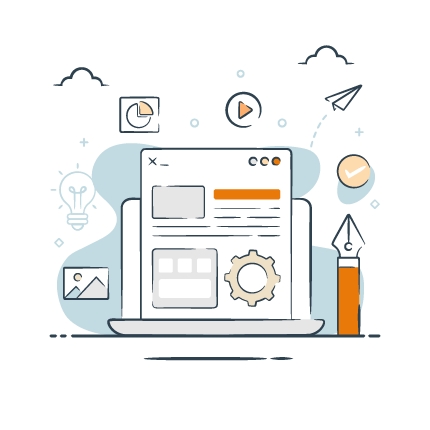
Design Techniques That Elevate Both Access and Aesthetics
Many of the principles that improve accessibility are the same ones that define strong, modern design. Clear visual hierarchy supports screen readers, but it also helps every user scan content more efficiently. High color contrast aids users with visual impairments while making layouts feel crisper and more confident. Thoughtful typography choices reinforce brand voice while improving readability, and generous spacing reduces cognitive load while creating a more premium visual experience.
Even motion and animation, when used intentionally, can enhance accessibility by guiding attention and reinforcing meaning rather than distracting from it. The result is website design that feels polished, intuitive, and easy to engage with, which is exactly what high-performing digital experiences are meant to deliver.
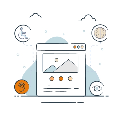
Legal, Ethical, and Performance Considerations
Accessibility is not just a design preference; it’s a business reality. Legal requirements around digital accessibility continue to expand, and organizations that overlook them face increasing risk. Beyond compliance, there is an ethical responsibility to ensure that digital experiences are inclusive and usable by as many people as possible.
There’s also a strong performance case. Accessible websites often load faster, perform better in search, and deliver stronger usability signals that support engagement and conversion. When accessibility is part of the marketing strategy, it tends to improve reach, credibility, and ROI all at once.
Accessibility is where compliance, ethics, and performance meet.
– Aaron Patterson, Software Engineer at FabCom
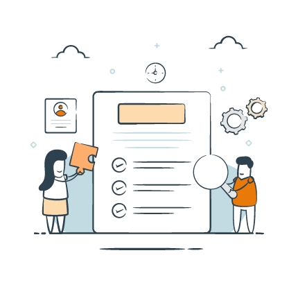
How FabCom Balances Compliance and Brand Expression
As a leading marketing and advertising agency in Arizona, FabCom integrates accessibility into the creative process from the beginning. It’s not a final audit or a last-minute adjustment, but a design lens applied alongside marketing brand strategy, visual identity, and user experience planning.
When accessibility is treated as a strategic design principle—not an afterthought—it changes how
creativity shows up across every digital experience.
– Brianna Jennings, Executive Vice President at FabCom
Our cross-discipline teams collaborate early to ensure accessibility standards align with brand expression rather than compete with it. WCAG guidelines are treated as creative parameters that guide smarter design decisions, not as limitations that flatten them. This approach allows us to deliver top-notch digital experiences that meet compliance requirements while remaining distinctive, expressive, and unmistakably on brand.
Why Accessibility is a Creative Advantage
Accessibility and aesthetics are not opposing forces competing for control of a design. When accessibility is embraced early and intentionally, it becomes a catalyst for clearer thinking, stronger visual systems, and more impactful brand experiences.
Designing with inclusion in mind leads to interfaces that are easier to navigate, content that is easier to understand, and interactions that feel more intuitive across devices and audiences. Those qualities don’t just benefit users with specific access needs. They elevate the experience for everyone, from first-time visitors to long-time brand loyalists.
From a marketing and advertising perspective, accessible design delivers tangible results. It expands audience reach, strengthens SEO performance, improves engagement, and supports conversion goals without sacrificing brand expression. Simply put, it’s design that works harder and smarter.
At FabCom, we see accessibility as an opportunity, not a constraint. It’s a chance to create digital experiences that are compliant, inclusive, and visually compelling, all while staying true to the brand story, because the most effective design isn’t just seen; it’s experienced, understood, and accessible to all.